
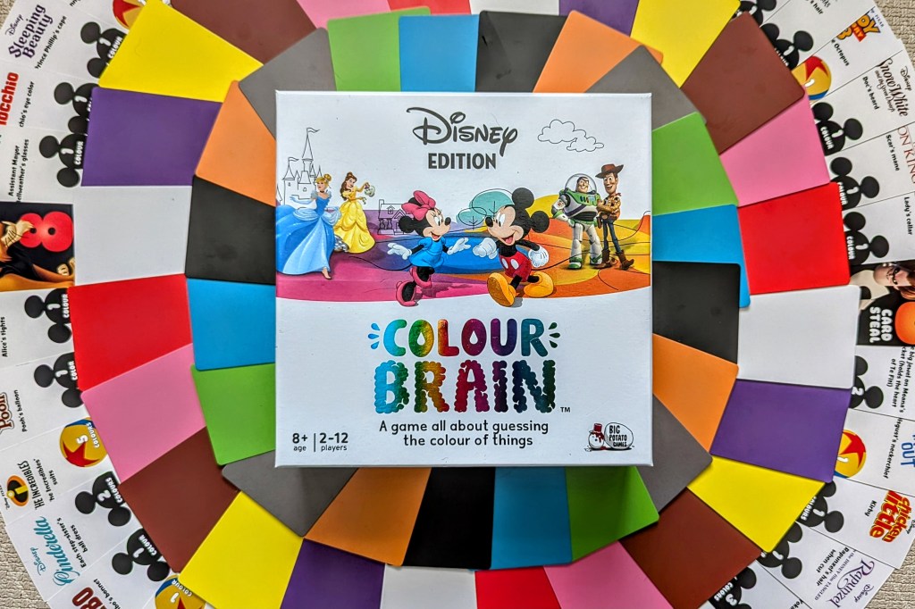
TGIFIF! (Thank god it’s first impressions Friday!). Today I’m talking about the Disney edition of Colourbrain. This was a Christmas gift from my family and I love Disney, so I was looking forward to this one!
Game overview:
👥 2-12 players (in 2-4 teams)
🧠 8 years+
Players are divided into 2 to 4 teams and given a hand of 11 different colour cards. A question card is revealed, which asks what colour(s) something is from a Disney or Pixar film. Teams race to put their colour cards face down that they think answers the question; the first team to do this shouts “Colourbrain!”, which gives remaining teams 15 seconds to get their answers in. Once everyone is ready, the answer and the teams’ guesses are revealed.
Scoring happens in one of three ways:
- If one team was right, they win the point!
- If more than one team was right, the point rolls over to the next question.
- If no one gets it right, no point is awarded, and it isn’t rolled over.
Each team is also given 1 ‘colour capture’ card at the start of the game, which can be used if your team is not in the lead. When played, 8 of an opposing team’s colour cards are stolen randomly from their hands for one round.
First team to 10 points wins!
Our first impressions:
I’ll start with the positives. We really like Colourbrain as a game (we played the original many years ago), it has a nice balance of being a general knowledge/trivia game, but you have a set option of answers in your hands so you can always have a guess. The Disney version is a great option for families and Disney fans (like me).
We also like that the game is plastic-free, e.g. the cards were wrapped in little paper bands rather than plastic. I think this is part of a wider initiative from Big Potato Games to be environmentally conscious (they are a registered B Corp), and they have a lot of games on their website that are plastic-free. Such initiatives should be applauded! (Although I would say the game did not need to be in a box this big, so there was unnecessary waste in that regard).
The majority of question cards are asking for 1 or 2 colours. There are a handful of 3 colour questions, and maybe a couple of 5 colour questions. The 1/2 colour questions are mostly very easy, so this skews it more to families/younger gamers. I would prefer a more 3 colour and up questions, so you can modify the difficulty a bit more. And in my opinion, there are some questions already in the game that would have worked better asking for more colours, such as Carl’s house in Up (it’s a very colourful house!).
A timer isn’t provided to time the 15 seconds for players to answer. On one hand I can understand this (probably less wasteful), but on the other hand I hate faffing with a phone timer during a game. We didn’t really time ourselves in the end, and it didn’t really affect the game.
The biggest issue with Colourbrain Disney is the quality, in both design and production. It just can’t be ignored and detracts from the game. The question cards in particular look so cheap – if you told me someone had made them at home, I’d believe you. It’s obvious that no thought has been put into how the cards and questions are designed. These are the examples we found from just one playthrough:
- I could forgive the mixed quality of the answer images (because they are taken from various films over the years), but some have funny cropping where the item in question isn’t fully in frame.
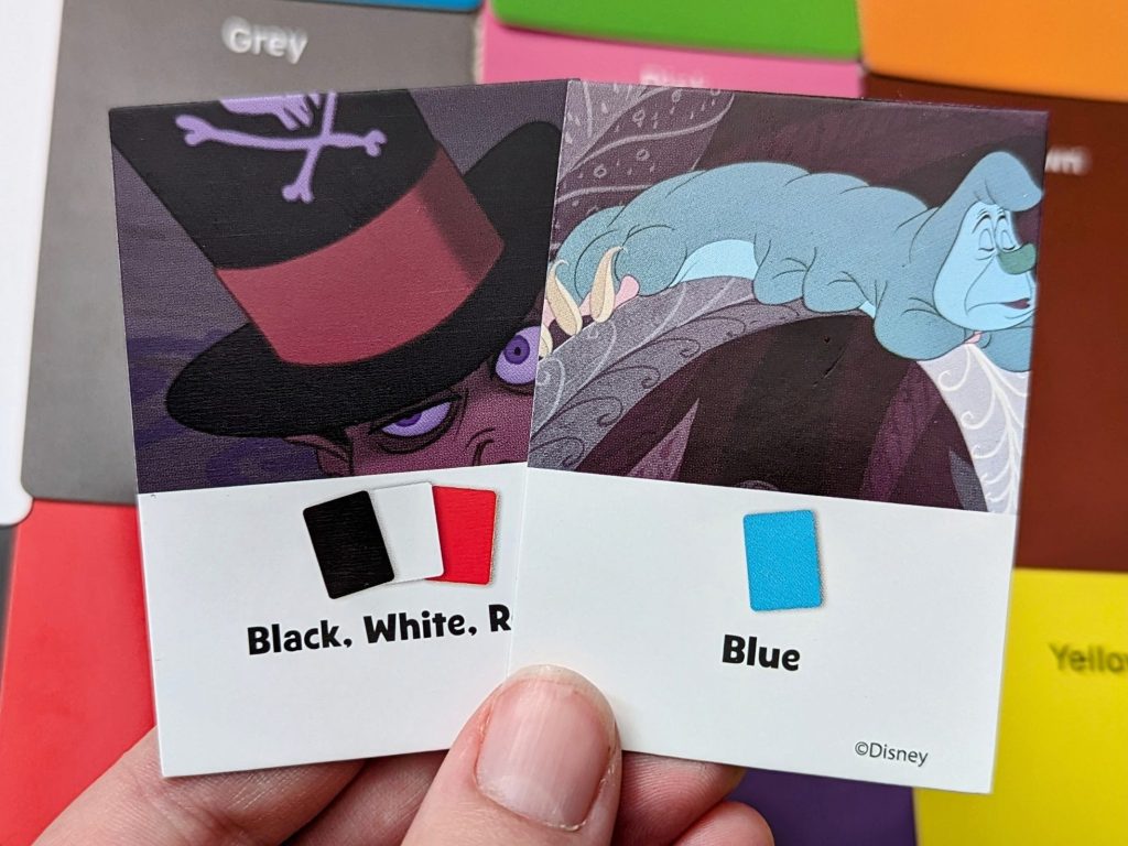
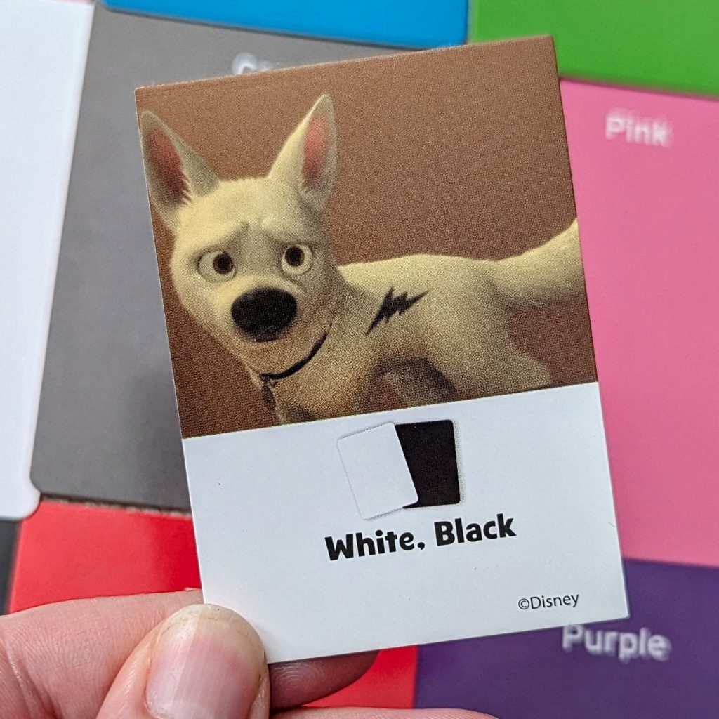
- Some of the answers are just plain wrong! E.g. Bolt’s fur is not black and white, it’s just white (the bolt is fake and only in the first act of the movie).
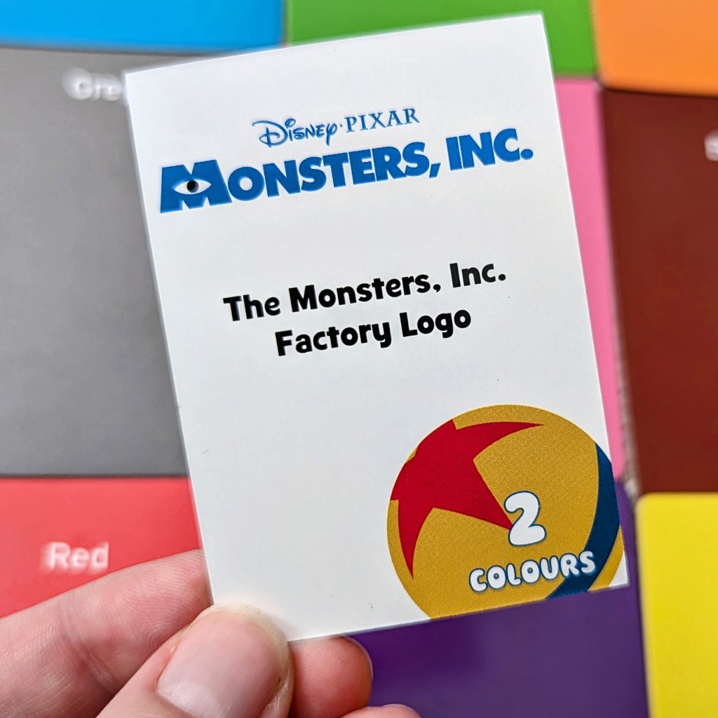
- There’s a Monsters Inc. question about the colour of the Monsters Inc. factory logo – which is on the question card you are reading!
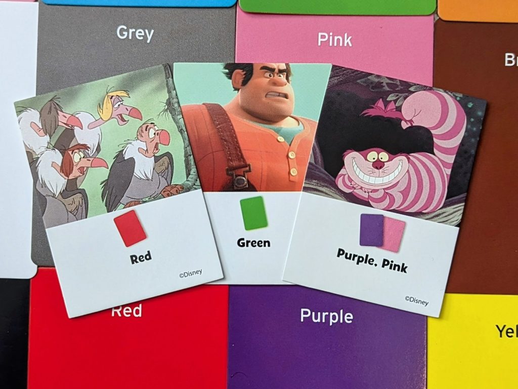
- The colours don’t always match the answer clearly. You would be forgiven if you weren’t sure what colour card best matches Ralph’s shirt – the answer might be technically green, but in real life it looks more of an inbetweeny colour (teal?). And apparently the vultures in Jungle book have red beaks, but you might argue they look pink. There are so many questions that could be taken from Disney/Pixar films, why pick things where the colours are a bit more subjective?
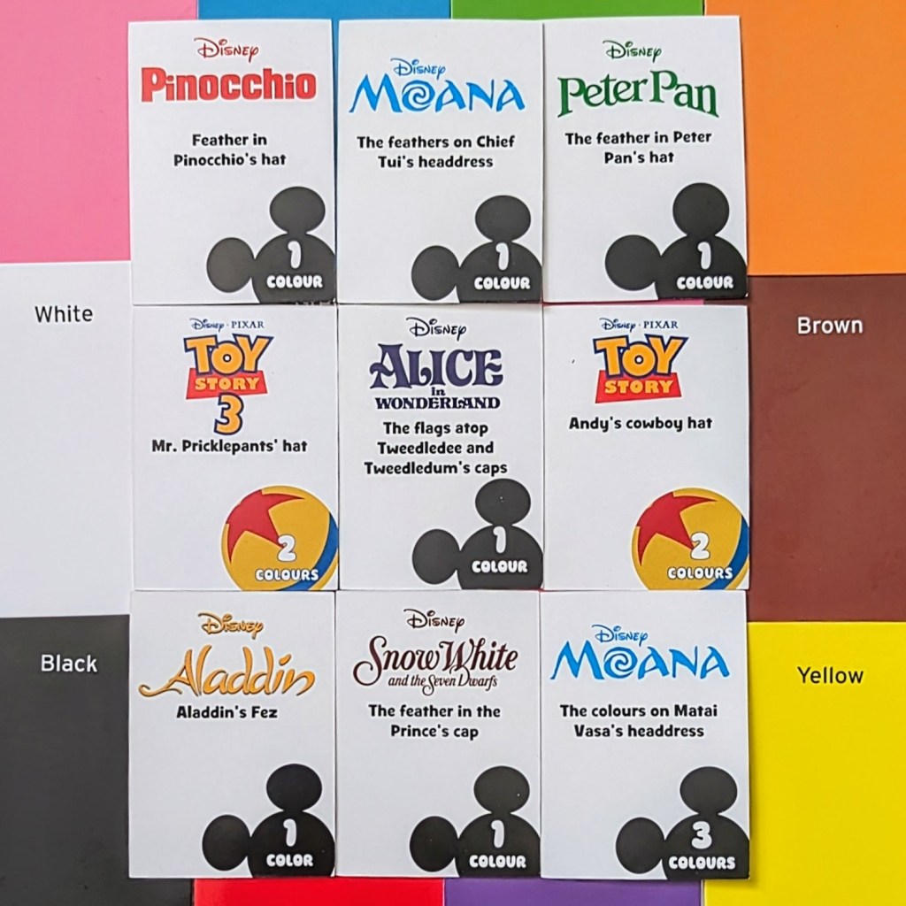
- We had 5 questions just on people’s hats/hat accessories, and there are at least 10 questions like this in the box (and a lot of them have red as the answer!). Again, there are so many things from the films that could be questions, why so many repetitive questions?
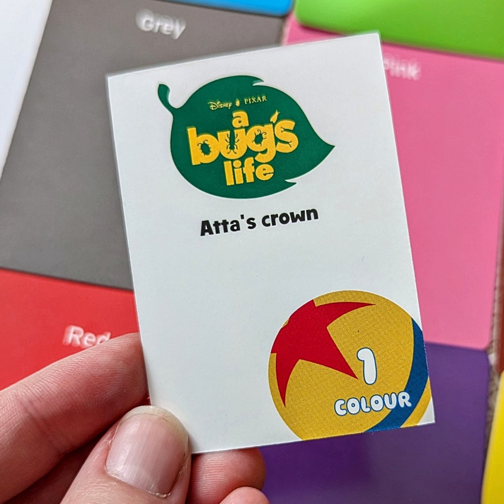
- There’s a Bug’s Life question about a crown, saying the answer is 1 colour – then they give 2 colours as the answer!

- Some of the questions are about Disney villains. Disney villains are on the colour capture cards, so you can have the answer in your hand.
- The team 1 logo is the same as the logo used on the Disney cards (Mickey’s ears). This is a bit more of a minor niggle but they should be different (like team 2’s logo being the Pixar lamp, and the Pixar question cards using the toy story ball).
- There’s more general quality issues like inconsistent card cropping, and some of the white backgrounds are completely different colour whites.
- The box inserts are equally cheap. It’s hard to get cards out, inserts get pulled out with them, flapping about everywhere – very annoying.
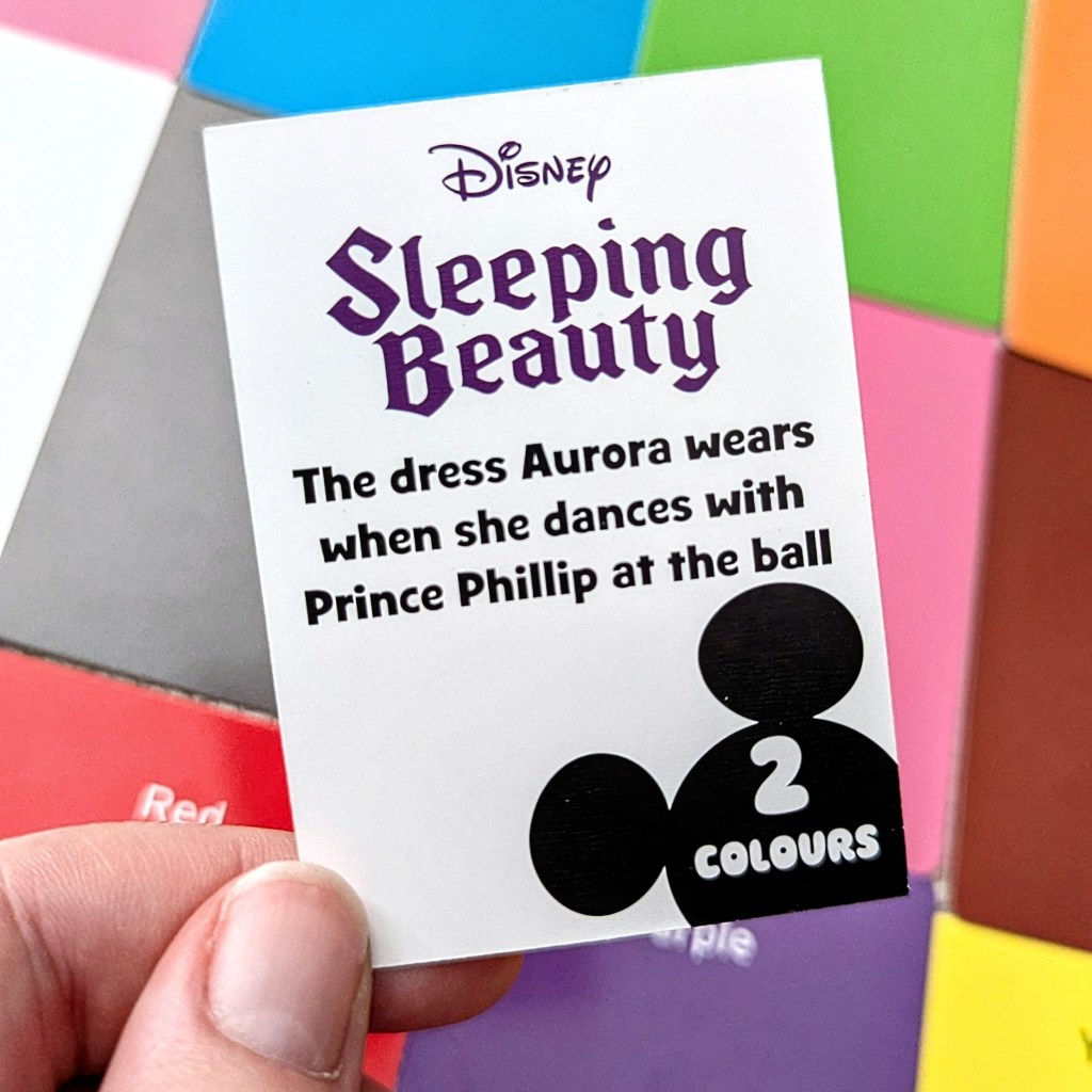
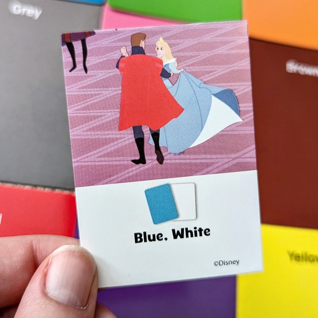
This question is sure to rile up the Disney Princess fans!
Final thoughts:
I was so excited for Colourbrain Disney, and then so disappointed. We both enjoy Colourbrain gameplay, but the poor quality and poor design (and wrong answers!) are just too frustrating, too distracting, and we couldn’t enjoy the game. It feels like so little love went into it, and it’s the most obvious cash grab game I’ve ever played. Maybe we should have expected that from an IP reimplementation, but I would think the basic minimum is the game being accurate. If I was Disney, I would not be impressed.
